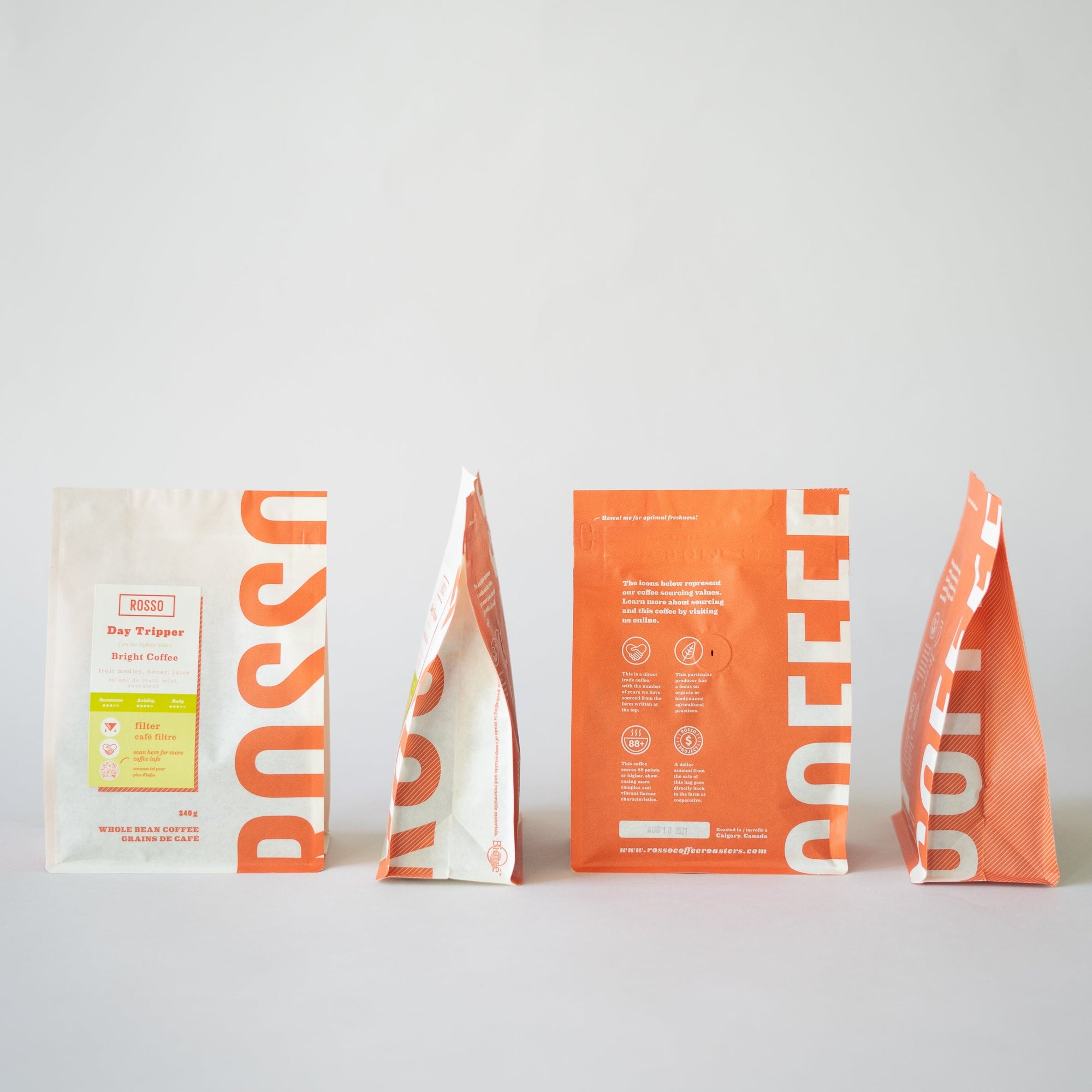

The 4.0 Bags: A New and Approachable Experience
Rosso's Bag Evolution
When we embarked on our roasting journey in 2012, our very first coffee bag was quirky and fun, conveying a certain handcrafted quality with references to our first location in Ramsay. All the coffee’s info was stamped by hand and a generic branded sticker applied to each of the kraft bags. This, coupled with our refillable glass jars, was a debut into coffee retail that we could be proud of. As our popularity grew and we started to sell more and more beans, it quickly became apparent that we needed a better long term solution (and perhaps some photos with less Sepia?)!

Photo credit: Instagram @commonlycoffee
 Photo credit: Instagram @mesomers19

Enter the Rosso bag version 2.0—our first custom branded bag. We kept the rustic kraft feel of our original bags, with the addition of the block bottom for better shelf perching. A sleek label with coffee info wrapped over the top, with the colour scheme of black for filter and red for espresso to finish off the look. This bag is also where our filter and espresso icons made their debut. These added features were a huge improvement to the functionality of our coffee bags as well as our production speed!

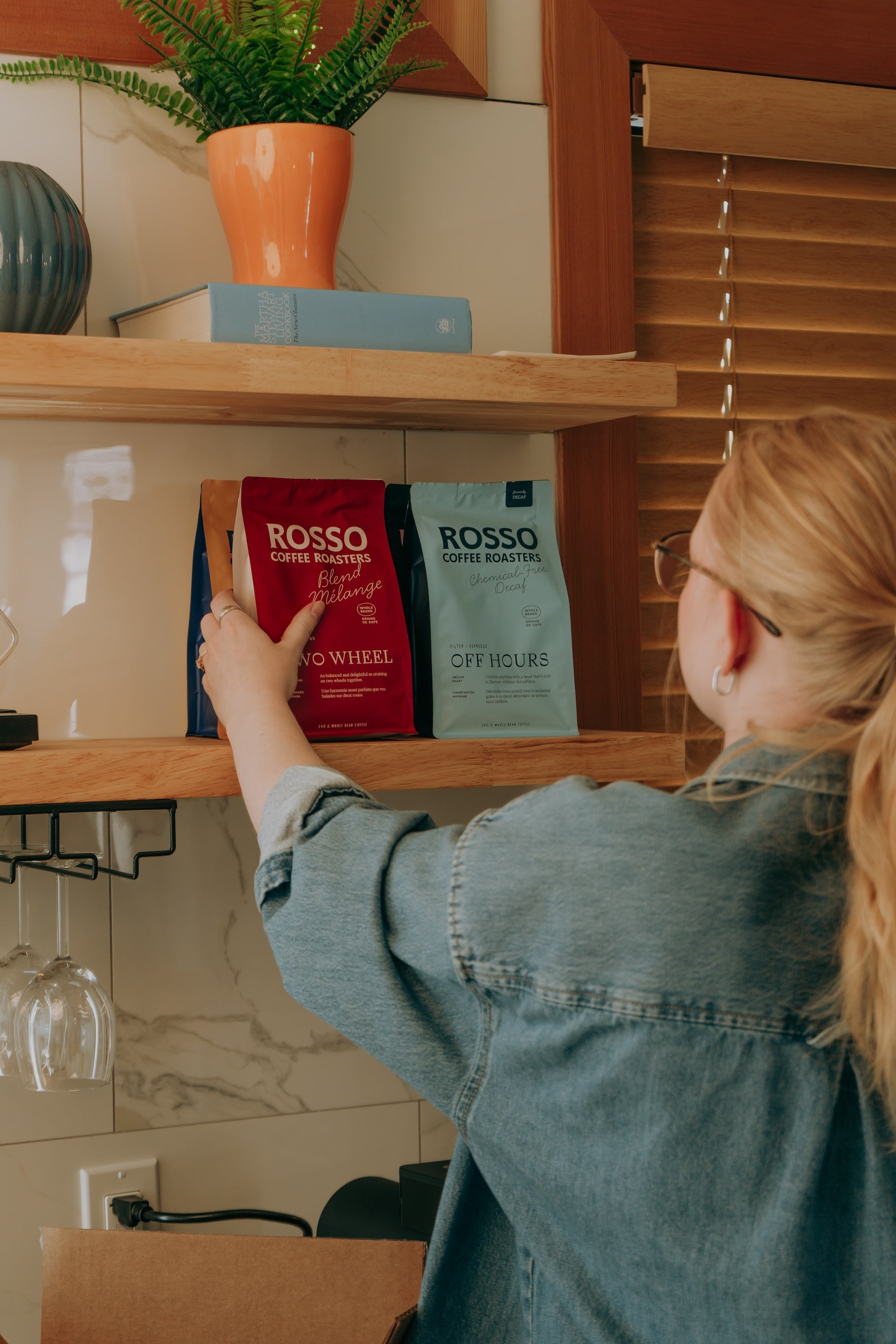
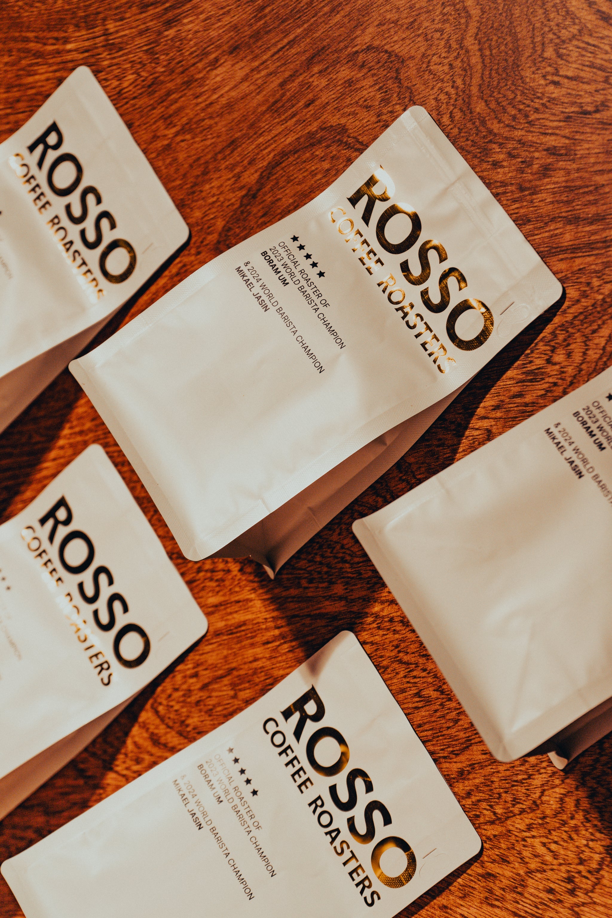
The third bag rendition saw further upgrades, with a resealable zipper for preserving freshness, a written description of how each coffee tastes, a coffee cherry pattern on the sides and bottom, as well as the new Rosso direct icons, conveying our direct trade sourcing practices. An alternate black and gold version for competition coffees and coffees scoring 88+ points on the cupping table soon followed.

The New 4.0 Bag

While there were many ideas as to what our next rendition should incorporate, they were distilled down into three main categories: vibrance, environmental impact, and accessibility.
Vibrance:
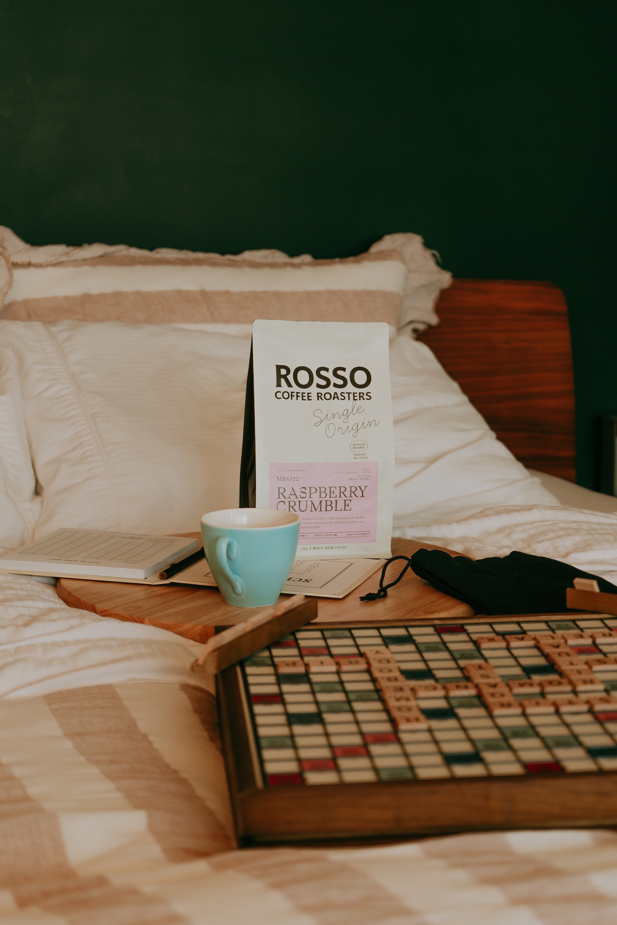
An eye-catching bag was top of mind in this redesign, while not straying too far from our bold, duotone branding we’ve become known for. We had the palette of red, black, and kraft for so long, it was time to shake things up a bit. Our refreshed colour scheme is inspired by the mid-century industrial and Swiss Style design. A hint of yellow was added to our traditional Rosso red, while the bright white transitioned to a creamy off-white. Enter colour! Each coffee label has its own distinctive hue so you can differentiate between them in a flash. Our typeface Eames Century provides a variety of weights as well as italics. Perfect for creating a mid-century editorial vibe that was instrumental to the design inspiration.
Environmental Impact:
The average coffee bag will last 1000 years in the landfill, not to mention all the emissions that go into the manufacturing process. Biotre 2.0 provided a solution for us without compromising on bean freshness. Every layer in their bag is made of plant based resources instead of fossil fuels, reducing our carbon footprint significantly. While not fully compostable yet, the outer layer will break down in a healthy backyard compost. This is a major step in the right direction as we await the development of the Biotre 3.0 fully compostable bag.
Accessibility:
We asked ourselves, “How can we make buying coffee as easy to navigate as possible for the average consumer, while still conveying all the relevant information to our coffee enthusiast crowd that loves to nerd out on the details?”
Our answer was to include these new additions to our bags:
Have no idea how to pronounce the name of a coffee? You’re not alone! Coffee professionals also struggle with this at one point or another. The coffee’s name is most often the farm/mill and, let's face it, you’re not going to have a firm grasp of every coffee-producing country’s language. We’ve all been there. You don’t want to feel silly mispronouncing a coffee’s name. So, you default to, “The Colombian one”.
This is why we’ve added our version of phonetics under every single origin coffee, a quick guide to help you pronounce each name. You shouldn’t feel like you have to be part of an elite club to be “in the know”.
- Sweetness, Acidity and Body Scale
- Coffee Info
Washed processed coffees will often present as a cleaner cup of coffee with a lower body. On the other hand, with natural processing, you will see a fuller and often sweeter cup with a distinctive set of tasting notes. Then there’s everything in between that industry professionals and coffee geeks truly get excited about, such as: anaerobic fermentation, honey processed, carbonic maceration, etc.
It’s worth taking note of these things with your favourite coffee, so you can buy something similar in the future or experiment by buying different varietals and processing methods than you’re used to.
It’s important to us that coffee producers are getting paid their fair share and we want you to know about it! Even though our Rosso Direct icons have been on the bags for a few years, you had to search on our website to find what those icons actually meant. That’s why we’ve added each one, with the definition, to the back of the bag. So, you can quickly scan what you’re buying and know what that means at the farm level.

We hope that the most recent rendition of our bags with the new features will make your experience from buying to tasting easy and approachable. As well as, provide assistance to find the perfect brew for you!

